


When You Treat People In A Shitty Way, They Are More Likely To Behave In A Shitty Way
Taking A Closer Look At The German Police Crime Statistics On Foreign Crime Suspects

A few months ago I watched an episode of one of my favourite German science shows MaiThink X about racism. At one point they criticise the police crime statistics on crime SUSPECTS - not convicts - for not only calculating metrics wrongly and applying visualisations incorrectly, resulting in very misleading conclusions about foreigners. MaiThink X also point out that the data collected by the police says more about the police’s way of working than about how criminal foreigners supposedly are.
I absolutely agree with MaiThink X. As I have explained in previous posts, how data is created and collected is the most important step in statistics. Not understanding that will lead to false conclusions - and actions.
From a data storytelling perspective I was still not satisfied with the corrections made in the show. So I thought “Then I’ll do it myself!”. And combine that with some best practices on data storytelling, all in one post - convenient, right?
Starting At The End
In contrast to a novel or movie, a data story should start with the great reveal. So here’s my interpretation of police crime statistics on foreign crime SUSPECTS.
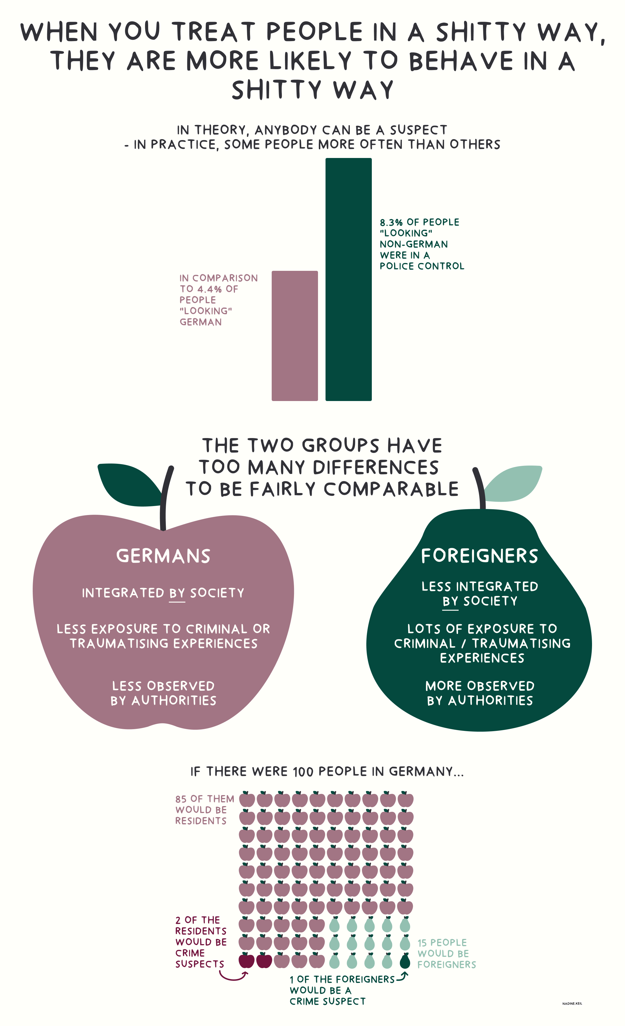
If you watched the episode of MaiThink X, you may notice that I changed not just the visualisations, but also swapped out some information. Let me explain why with this next best practice.
If you enjoy my blog posts and would like to support my work, you can buy me a coffee.
Your Message Or Why Should People Care?
The mistake I most often see made by analysts is jumping straight into analysing the data without having an idea of the outcome. That’s like starting a puzzle without knowing the picture. You can do that if you have a lot of time and no pressure, but not if you want to help people solve a critical problem.

Start by thinking about the message you want to tell people. A message is usually a belief, something that the person or group of people working with the data assume to be true. It’s highly subjective, ergo data is subjective - something that many people, especially data analysts, don’t want to hear. Your belief influences the hypotheses formulated and the way data is interpreted. People are rather looking for confirmation than rejection.
A good way to avoid this trap is to question your beliefs and ask yourself “Which information is needed to prove me wrong?”. You’ll get a much better understanding of which data to analyse.
My Belief: All People Are Generally Good
Regarding the police crime statistics, my personal belief is that people, no matter where they are from, are generally good. People who do bad things usually do them because they have been treated badly. They are traumatised, haven’t learned differently or are desperate. It’s their way of solving their personal problems, which most often is surviving under harsh circumstances. I believe crime is a symptom of an underlying problem, not the cause. Treating symptoms and not the cause is like putting a bucket under a leaky roof instead of fixing the hole.

People Are Busy, So Give Them The Important Stuff First
People want information quickly and easily - like a snack. Yes, it would be wonderful if people understood the importance of complex topics and took the time. However, you can’t force them to. That doesn’t mean you can’t nudge them in that direction. Instead of just a snack you can offer a buffet: start with quick and easy snacks for the busy bees, continue with more indulgent treats for the kicked-back koalas.

That’s how I structured this blog post: I put the most important information I wanted people to take away - the infographic - at the beginning. The explanations and best practices are the treats for people interested in data storytelling techniques.
Regarding the infographic itself, I put my conclusion from the data analysis right at the top. You may think “Isn’t the title there to grasp attention?” - yes and no. Keep on reading to find out what I mean.
Use The Same Language As If Talking To Family Or Friends
The information included in the title - when people are treated badly, they likely behave badly - is sufficient on its own. The data visualisations are backing up my claim with context and data.
The phrasing of the title is serving two purposes:
It’s intended to grasp people’s attention (you got me there!).
It’s also representing my personal tone. That’s the way I talk and I want people to know that.
Bringing in your authentic self in your data story is the best way to make it interesting. Data doesn’t have to be boring, and a story most definitely shouldn’t be boring. Ideally, use the language which you also use when talking to friends or family - that still implies being respectful!
If you think “That’s not possible in a corporate environment!” - yes, it is! Cut out the bullshit words, the business jargon, and use simple words.

First Impression Counts
In the infographic I arranged the different information purposefully. The order of information in a story highly influences how it is interpreted by people. The first information is usually perceived as most important. It is also remembered the most, as people’s attention decreases quickly.
A data story is not a fiction novel, where you can reveal that the seemingly loving husband was the murderer all along at the very end. Sorry to say, data is often not THAT interesting - that’s coming from a mathematician!
Treat your story like a date or a job interview: communicate your message right from the beginning. Make sure people don’t misinterpret your data story.
I started the data story of foreign crime SUSPECTS with a statistic about racial profiling. Right after that I point out the differences between foreigners and Germans. With these two information I end telling the story of a discriminated group of people, instead of framing foreigners as more criminal.
If Applicable, Avoid Using Abstract Forms
My last best practice is about the visualisations. As you can see I did not use traditional simple shapes like squares or circles, except for the very first visualisation.
I wanted to highlight the differences of the groups. Colour alone does not do the trick, the shape is way more powerful.

I didn’t do that for the first visualisation. The most important take-away of that one is the size difference, which is more recognisable with similar and easy shapes like rectangles.
When choosing a visualisation, really think about the main take-away of it. For me what works best is trying to explain it without any visualisations first - just words, ideally using analogies, painting the message and visual in my head. Or even better the head of a sparring partner (read my blog post on the value of sparring).
Summary
Here’s a summary of best practices in data storytelling:
Before analysing the data, be clear about the message of your data story
Start your data story with the results of your analysis
Order your results by importance and make them snackable
Leave details as treats for more interested people
Use common language and cut out the business jargon
Avoid using abstract forms in data visualisations and work with analogies
Hi, I'm Nadine - mathematician, former teamlead of data analytics and data science teams, and a craftsperson of data stories. If you wish to become one yourself and easily engage and convince your audiences instead of bore them with numbers and charts, then let’s talk!
Check out my website for more information. You can book a free 30-minutes introduction call with me right here, send an email to nadine@mathemalytics.com, or connect with me on LinkedIn.
If you enjoy my blog posts and would like to support my work, you can buy me a coffee.
First of all I liked your post. But your premise that all people are “good” is a value statement that fails unless we all agree on a definition of “good”. But we needn’t worry about such subjective definitions if we evaluate a person or group of individuals actions without placing any value on it. For example, some individuals from a group will obey their elders or any authority figure, no questions asked. Other people will challenge anyone who is not a member of their group (however that may be defined). We needn’t worry about whether we prefer one group’s behavior versus the other. We only need to use such data to determine how to interact with each group. In other words, one size will not fit all groups.
Also, treating people “shitty” is another subjective value statement. Not only is it context dependent but it will vary depending on a particular person’s culture. My personal experience will be very different from someone else’s. They may be horrified when I explain my way of training someone, my children, my employees, my friends or any other individual or group of individuals that I habitually interact with.